
The Ultimate Print-Ready File Checklist
Submitting print-ready files is the most critical step in ensuring your project turns out exactly as you envisioned. While commercial printing equipment is sophisticated, it can't correct fundamental errors in the artwork file itself. Mistakes in file preparation are the leading cause of common printing problems, including:
- Unexpected white borders around your design after trimming.
- Noticeable color shifts, where printed colors don't match what you saw on screen.
- Blurry or pixelated images that detract from the professional look.
- Costly production delays as files are sent back for correction.
- Expensive reprints if errors are only discovered after the job is complete.
Fortunately, by understanding and verifying a few key print file specifications before you submit your order, you can avoid these pitfalls. This guide covers the five essential checks every designer, marketer, or business owner should perform.
1. Bleed and Safe Zone: The Foundation of a Trimmed Print
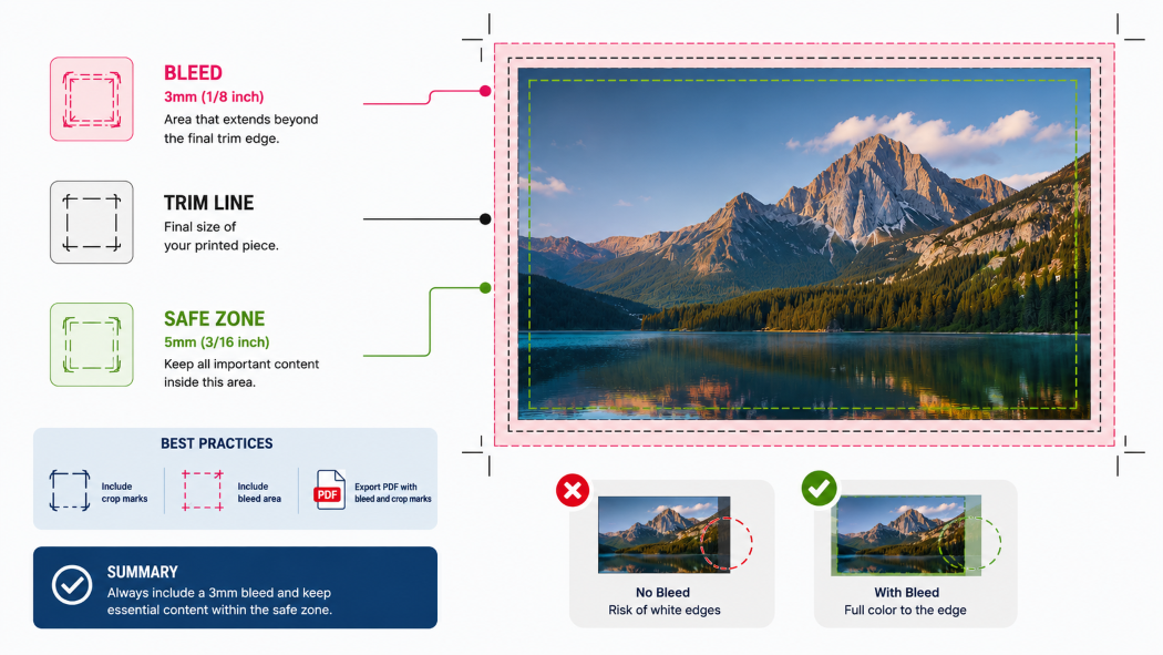
The 'bleed' in commercial printing refers to the extra margin of design that extends beyond the final trim edge of your printed piece. This is crucial because printing presses don't cut paper perfectly to the edge. A standard bleed of 3mm (or 1/8 inch) ensures that after trimming, there are no unwanted white borders. Without adequate bleed, any slight variation in trimming can result in a thin white line showing where the image was cut short.
The 'safe zone,' conversely, is the area within the trim line where all important content—like text, logos, and critical graphic elements—should reside. It's recommended to keep these elements at least 5mm (or 3/16 inch) inside the trim line to prevent them from being cut off or appearing too close to the edge. Always export your files with crop marks and visible bleed so your printer can accurately trim your project.
Summary: Always include a 3mm bleed and keep essential content within the safe zone (at least 5mm from the trim edge).
2. Color Mode: CMYK, Not RGB, for Accurate Prints
The distinction between RGB (Red, Green, Blue) and CMYK (Cyan, Magenta, Yellow, Key/Black) color modes is fundamental for print. RGB is an additive color model used for digital displays like monitors and phone screens, creating colors by emitting light. CMYK is a subtractive color model used in printing, where colors are created by layering inks on paper.
When you submit an RGB file for commercial printing, it must be converted to CMYK. This conversion process can lead to significant color shifts because the CMYK gamut (the range of colors it can reproduce) is smaller than the RGB gamut. Bright, vibrant RGB colors often appear duller or different when printed in CMYK. For critical color matching, consider using Pantone (PMS) spot colors, which offer precise, consistent color reproduction.
Summary: Always convert your files to CMYK before submitting them to your printer. Use Pantone colors for critical color matching.
3. Image Resolution: Aim for a Minimum of 300 DPI
DPI stands for 'dots per inch,' a measure of the resolution or detail of a printed image. For commercial printing, a minimum resolution of 300 DPI at the final print size is considered standard for high-quality results. Images designed for web use are often much lower resolution (e.g., 72 DPI) and look fine on a screen but will appear pixelated or blurry when printed.
Simply enlarging a low-resolution image will not improve its quality; it will only make the pixels more apparent. Before ordering, verify the resolution of all images in your design at their intended final print dimensions. If an image appears blurry on screen at its final size, it will certainly be blurry when printed.
Summary: Ensure all images are at least 300 DPI at their final print size. Avoid using web-optimized images for print.
4. Use a Proper Print PDF Format
While you might be familiar with standard PDFs for everyday document sharing, commercial printing requires specific 'print-ready' PDF formats, such as PDF/X-1a or PDF/X-4. These standards ensure that your file contains all necessary information for professional printing, including embedded fonts, high-resolution images, and correct color profiles, and they flatten transparency to avoid production issues.
PDF/X-1a is an older but widely supported standard, while PDF/X-4 is newer, supports transparency better, and is generally preferred for modern workflows. Crucially, ensure all fonts used in your document are embedded within the PDF. This prevents the printer from having to substitute fonts, which can alter your design. Whenever possible, export your print-ready PDF directly from design software like Adobe Illustrator or InDesign using their built-in PDF/X presets.
Summary: Export as a PDF/X-1a or PDF/X-4. Ensure fonts are embedded and transparency is correctly handled.
5. Paper Weight and Finishing Matter More Than You Think
The choice of paper weight and finishing can significantly impact the perceived quality and durability of your printed materials, as well as the overall cost. Paper weight is often measured in GSM (grams per square meter), with higher numbers indicating thicker, more substantial paper.
For flyers, a lighter weight like 100-150 GSM might suffice, while brochures and catalogs often benefit from 170-250 GSM for a more premium feel. Business cards typically use cardstock of 300 GSM or higher. Finishes like gloss coating add shine and vibrancy, matte coating offers a smooth, non-reflective look, and soft-touch lamination provides a luxurious, velvety feel. These choices influence how your design looks and feels to the touch, affecting customer perception and the longevity of your printed piece.
Summary: Consider paper weight (GSM) and coating/lamination for perceived quality and durability. Request samples if unsure.
Three Mistakes That Delay Print Orders Every Time
Beyond the core five specifications, certain common errors consistently cause delays and frustration in the commercial printing process. Being aware of these can save you significant headaches.
1. Sending RGB Files and Expecting Accurate Printed Colors
As discussed, RGB is for screens, CMYK is for print. Submitting RGB files means your printer must convert them, often leading to unexpected color shifts. This requires communication, file correction, and re-proofing, all of which add time to your production schedule. Avoidance: Always convert your files to CMYK before uploading.
2. Treating a Digital Proof as a Color Proof
A digital proof (like a PDF sent via email) is excellent for checking layout, typos, and general content. However, it's displayed on a monitor calibrated differently from how inks will appear on paper. It cannot accurately represent the final printed colors. Relying solely on a digital proof for color accuracy will likely result in disappointment. Avoidance: Request a contract proof or a physical proof if color accuracy is critical.
3. Skipping Bleed to Meet a Tight Deadline
In a rush, designers might be tempted to remove bleed and crop marks to simplify file setup or reduce file size. This is a false economy. Without proper bleed, the risk of unwanted white edges after trimming is extremely high. Correcting this often involves re-designing elements to extend to the edge, which takes more time than setting up bleed correctly from the start. Avoidance: Always include the standard 3mm bleed, even on tight deadlines.
Conclusion
Mastering these five print file specifications—ensuring correct bleed and safe zones, using CMYK color mode, maintaining 300 DPI resolution, exporting proper print-ready PDFs, and considering paper weight and finishing—is the most effective way to guarantee high-quality results from your commercial printing projects. Proactive file preparation not only prevents common and costly mistakes but also streamlines the entire production process, saving you valuable time and money.
At Printsquare, we understand that navigating print specifications can be complex. That's why our team reviews every customer file before production begins to catch potential issues. We also provide complimentary digital proofs for your review, allowing you to confirm layout and content. By following this checklist and trusting our expertise, you can be confident that your printed materials will meet your expectations.
Frequently Asked Questions (FAQ)
1. What is a 'print-ready' PDF?
A print-ready PDF is a PDF file specifically formatted for commercial printing. It typically includes embedded fonts, high-resolution images, correct color profiles (CMYK), bleed, and crop marks, often adhering to standards like PDF/X-1a or PDF/X-4.
2. Can I use RGB images in my print file?
While you can place RGB images into a document that will eventually be converted to CMYK, it's best practice to convert images to CMYK before placing them or at least ensure your design software's color settings are configured for CMYK output. Submitting fully RGB files can lead to unpredictable color shifts.
3. How do I know if my image resolution is high enough?
Check the image resolution in your design software at the final print size. For most commercial printing, 300 DPI is the standard. If an image looks pixelated or blurry when viewed at its intended print dimensions on screen, it's likely too low resolution for print.
4. What's the difference between PDF/X-1a and PDF/X-4?
PDF/X-1a is an older standard that requires CMYK or grayscale color and does not support transparency. PDF/X-4 is a newer standard that supports transparency and can include RGB color spaces (though CMYK is still preferred for print). PDF/X-4 is generally more flexible and recommended for modern workflows.
5. Why do I need bleed?
Bleed is an extra margin of your design that extends beyond the trim line. It's essential because printing machines don't cut paper perfectly. The bleed ensures that after trimming, your design extends to the very edge of the page without any unsightly white borders.
File check
